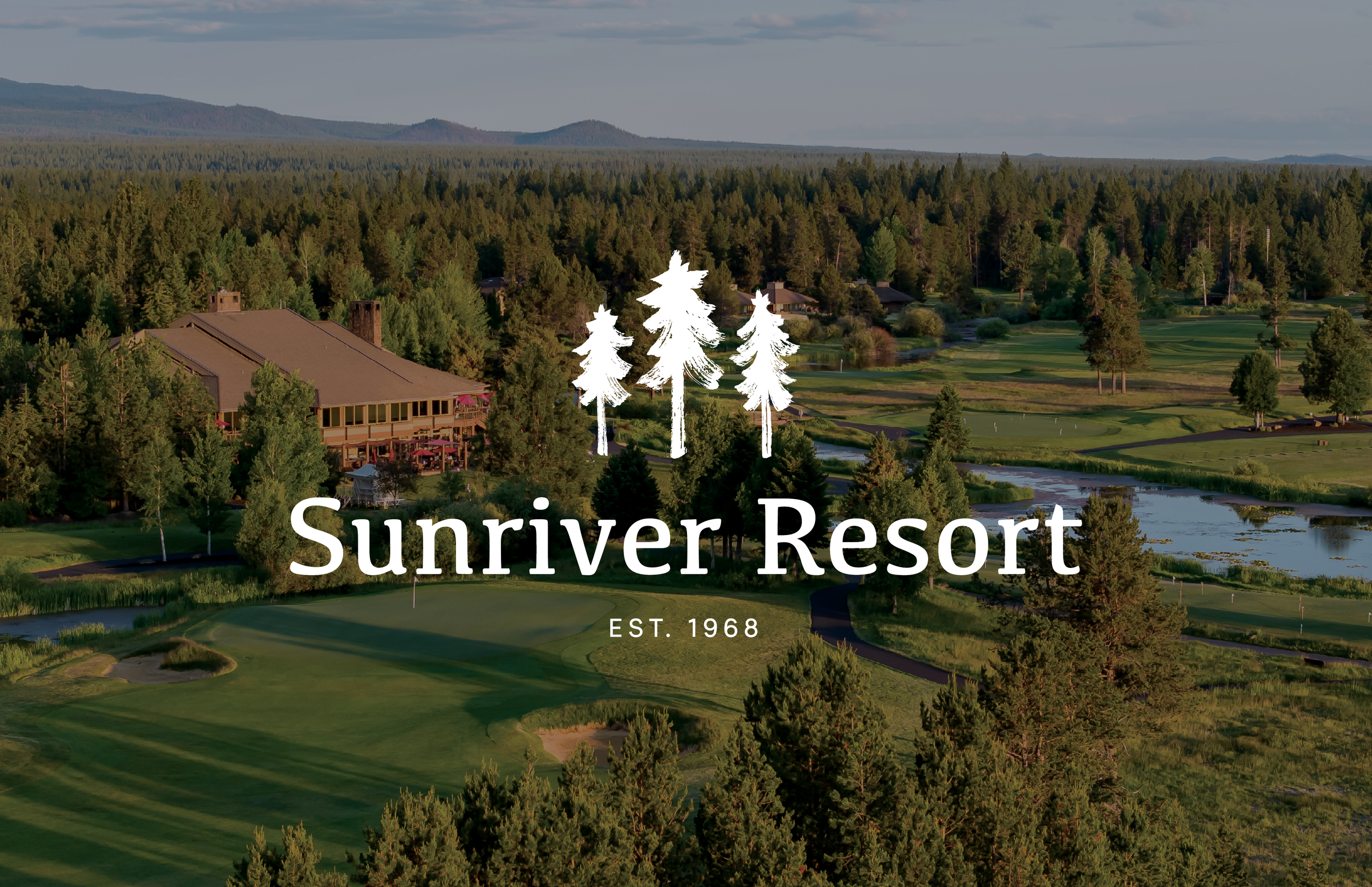


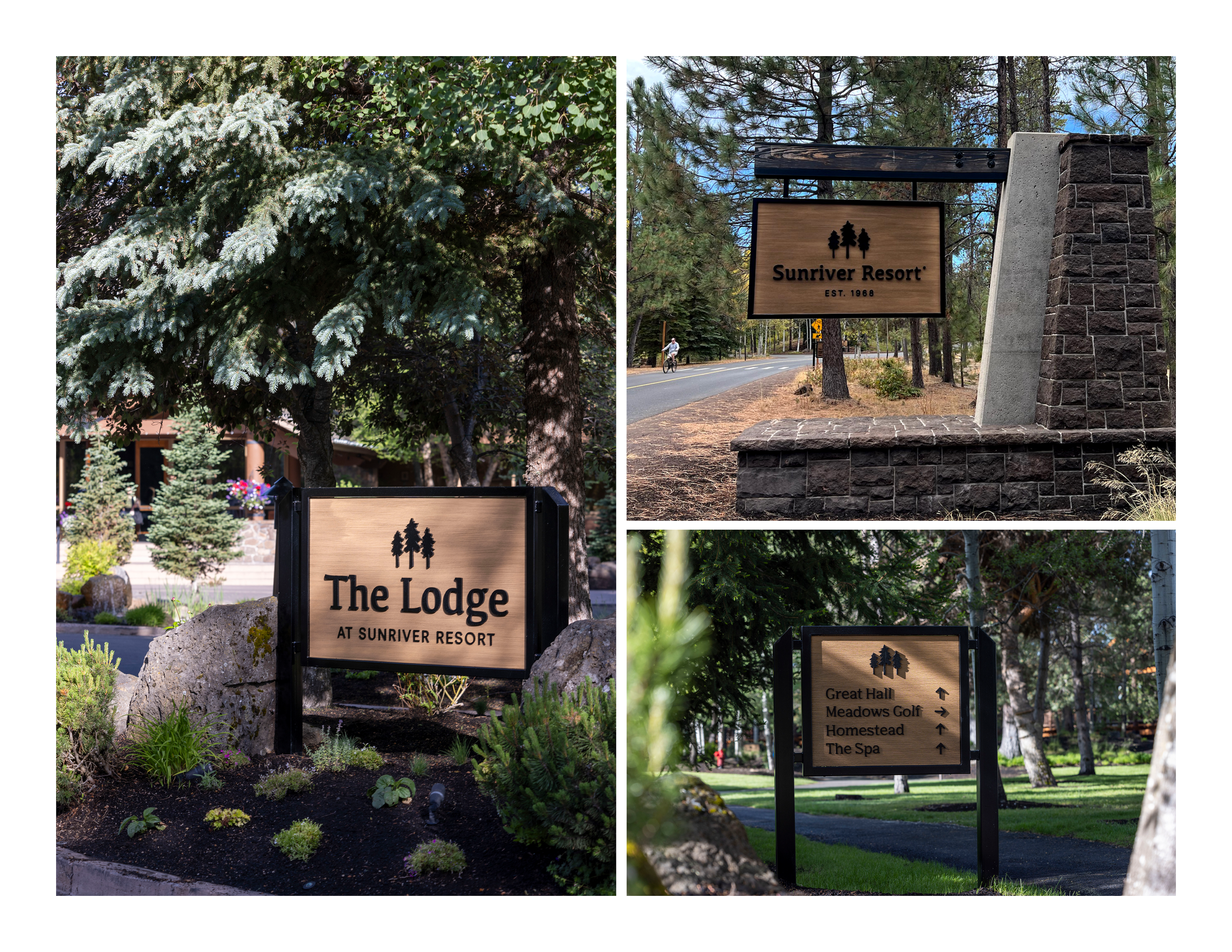


Visual Identity
The Sunriver Resort brand refresh was designed to reflect the natural beauty of central Oregon, using earthy blues and greens. A hand-painted brush pen logomark of three trees adds depth, texture, and a sense of human connection to the land.
The result: A warm, inviting, and versatile identity that resonates with guests and complements the resort’s surroundings.